
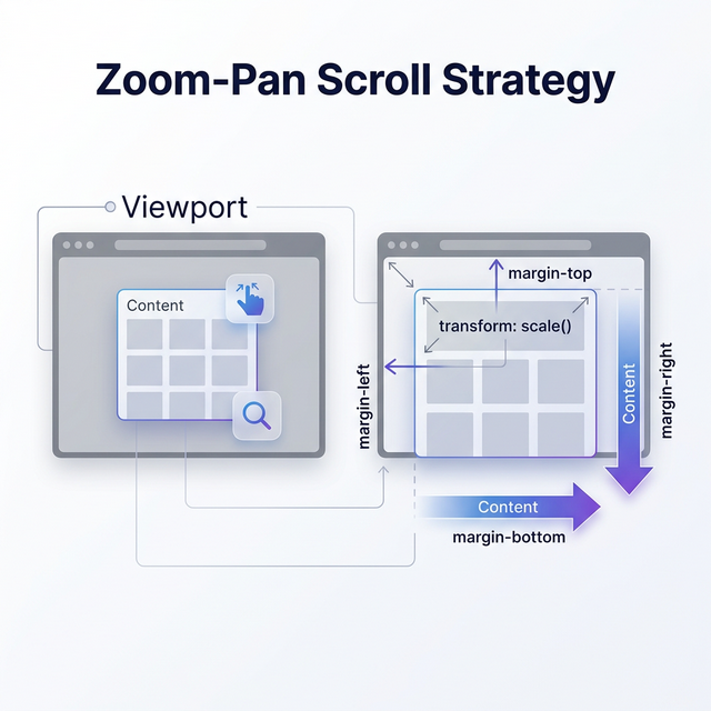
這是最關鍵的概念:
transform: scale(2); /* 視覺上放大 2 倍,但元素在 layout 中的尺寸不變 */
瀏覽器的排版引擎(layout engine)完全忽略 transform,所以父容器的捲動範圍不會因為子元素放大而改變。這就是為什麼需要用 margin 手動補上差額。
transform-origin: 0 0;   /* 從左上角開始放大,內容向右下擴展 */
transform-origin: center; /* 預設,從中心放大,四個方向都會擴展 */
用 0 0 是因為搭配 overflow: auto 時,捲動只能處理「向右」和「向下」的溢出。如果從中心放大,向左和向上的部分會被截掉。
原始寬度: 400px, scale: 2
視覺寬度: 800px, 但 layout 寬度仍是 400px
margin-right: 400 × (2-1) = 400px
layout 總寬度: 400 + 400 = 800px ← 捲動範圍正確了
這是一個 workaround,因為瀏覽器不提供「告訴 layout 我的 transform 後尺寸」的 API。
| 屬性 | 意義 |
|---|---|
offsetWidth |
元素的 layout 寬度(含 border、padding) |
scrollHeight |
元素的完整內容高度(含溢出不可見部分) |
clientHeight |
元素可見區域高度(不含 scrollbar) |
用 scrollHeight 而非 offsetHeight 是因為報表內容可能本來就超過一頁。
touch-action: pan-x pan-y;  /* 允許瀏覽器處理捲動,但禁用瀏覽器的 pinch-zoom */
touch-action: manipulation;  /* 允許捲動和 pinch,禁用 double-tap-to-zoom */
touch-action: none;          /* 全部由 JS 處理 */
Scroll 策略用 pan-x pan-y:讓瀏覽器負責捲動,Hammer 只處理 pinch 縮放。
CSS zoom 會真正改變 layout,理論上更適合,但:
iOS Safari 對 Shadow DOM 內的 zoom 支援有問題
不是 CSS 標準屬性(雖然 Chrome/Safari 支援)
MDN: zoom — 注意相容性表格
掌握前 3 點就能理解 scroll 策略的設計邏輯。
| Transform | Scroll | |
|---|---|---|
| 縮放對象 | 元素本身 | 子元素 |
| 平移方式 | Hammer 手動計算 | 瀏覽器原生捲動 |
| 適用場景 | 單張圖片 | 可捲動的長內容 |
| 使用處 | 燈箱式觀看效果的圖片(不須捲動) | div |